The approach behind the creation of the Ypertex logo—and the similarities between visual designs (like logos) and conceptual designs (like IT solutions).
For a blog claiming to primarily write about design (according to its current tag line “Design, Technology, Future”), I have yet to do so after three articles. Let me change that today—but before I write about other people’s designs, I would like to first promote my credibility and address one of my designs: this blog’s logo.
This article explains how I generally approach new designs using the example of the Ypertex logo. I follow a two-step process of which, interestingly enough, the first step stays the same whether creating a visual design (i.e. for a logo) or a conceptual design (i.e. for an IT solution).

The first step consists of collecting the requirements for the design; the second is implementing them in an actual design. Before I give you the requirements I had defined for this blog’s logo, let me explain the process behind step 1.
Object and Objectives of a Design 
Before actually designing anything, designers have to understand two things:
- What is (not) the object of your design?
- What are (not) the objectives of your design?
It may appear trivial to ask these questions, but their answers are fundamentally important and need to be given before starting with any design. In IT, this first step is called Requirements Engineering which helps to make sure you fully understand what your client wants—and in my experience is the project phase in which the most costly errors are made.
A characteristic of professional designs is that most (if not all) of their elements are intentional. This also includes the intentional absence of elements that are not essential to the design (what I call the Art of Omission). Asking the negative variants of the two questions hence is equally important.

The design object provides the expected scope. What exactly means i.e. “designing a mobile phone”? Does it refer to the outer case or the inner electric circuits? Does it include the graphical user interface?
The design objectives set the expected quality. I.e., should the mobile phone rather be as slim and light, as energy efficient, and/or as cheap as possible? What should your design primarily achieve and where are trade-offs acceptable or even irrelevant?
Good designers are good requirement engineers: They first observe, ask lots of questions and listen closely to the answers. Only then, they start designing.
From a grammatical point of view, the first question asks for nouns or names while the second asks for adjectives.
Designs are like projects: You might have never done such a design or project before but yet you can follow practices and processes that will lead you to a positive result every time. Asking the above questions is as important to designers as it is for software developers, construction workers or anyone else working on projects. It helps ruling out misunderstandings as early as possible.
Furthermore, the answers to the two questions provide objectively measurable requirements—based on which we later can judge the scope and quality of a particular design. By the way, this is also a fundamental difference between design and art:
You can’t judge art. You just don’t have the specifications of the object and the objectives for doing so.
Scope and Quality Requirements for the Ypertex Logo 
Now that I have established that every design requires the object and the objectives to be properly crafted and judged, let me give you the scope and quality requirements I had for this blog’s logo. Then you can be the judge of whether my design fits the purpose.
Scope 
In this case, the object of the design was pretty clear. I defined the term “logo” as follows:
- Designing the logo includes …
- An icon for my blog
- A color scheme
- Designing the logo excludes …
- The definition of the blog’s name and identity (already given)
- The design of the blog’s template theme (following later)
Quality 
OK, the object was easy but what about the objectives? I had two sources of requirements:
- Usage: how I wanted to primarily use the logo (as favicon or avatar)
- Identity: what core values the logo should represent (based on the kind of content I wanted to publish on my blog)
From these sources I had collected and interpreted the following requirements:
| Requirement or input | My interpretation in terms of visual design |
|---|---|
| iconic, recognizable | minimalist, unique, readable even in small sizes |
| usable as circular avatar | square form without elements in the corners |
| personal | organic or rounded forms, warmer colors |
| transparent | (no interpretation necessary) |
| in-depth | front and back layers |
| contemporary | flat, sans-serif, no decorative elements |
| technological | geometric forms and sharp edges, colder colors |
| future-oriented | left-to-right forward dynamic |
Translating design requirements into design elements is comparable to translations from one spoken language into another: A large portion of it is simply a matter of looking up the translation in a dictionary; the rest of the translation is based on experience with nuances.
Unfortunately, there is not just one global dictionary for visual design that offers translations to shapes, colors, textures, lighting, space, and direction. These translations or interpretations rely on the context like i.e. one’s cultural area (in my case: Western Europe). Let us take a look at my above requirements, most notably the requirement “future-oriented”: In my culture, we read from left to right—so a visual representation of going forward could be conveyed by a perceived movement from left to right. This might be different in other cultures and also apply to the meaning of shapes and colors.
The attentive reader also might have noticed: Some of my interpretations of individual requirements contradict each other. For example, the color interpretations of “personal” and “technological” oppose each other (warm vs. cold). The interpretations for “in-depth” and “contemporary” clash, too (layered vs. flat). Be thankful for a few contradictions since they add tension and invite you as a designer to play with the different options to see what works best.
Implementing the Requirements in the Ypertex Logo 
Up to this point, designing the logo was nothing more than collecting requirements and trying to translate them to visual elements—a diligent but routine piece of work. Now came the fun part: exploring and finding a solution within the confines of the requirements.
In the following paragraphs, I will mostly focus on the ideas that worked. Rest assured that it was not as straight forward and smooth as it might appear below. There certainly were ideas that led to a useless result. More than once I followed down a path to find out that I could not make an idea work out and had to start over—which is a perfectly normal part of the design process. In some cases one can come back to an earlier draft to take different approaches, basically branching off different designs from a common base design. Let me get back to this in the end when discussing the value of exaggeration.
Starting With Symbolism 
The way I start to work on logo designs is to look for symbols that relate to the name or mission of the entity behind the logo. In my case, the name was Ypertex and my mission was to publish my thoughts about topics like design, technology, and the future.
The name Ypertex comes from Hypertext—the technology behind today’s World Wide Web used to write my articles (in the so-called Hypertext Markup Language, short HTML) and deliver them to you (with the so-called Hypertext Transfer Protocol, short HTTP). Symbolic characters that I associate with these technologies are smaller/larger signs and slashes like <> in HTML and // in the syntax of HTTP addresses.

These associations are subjective. You might have completely different ones and disagree with me. That is perfectly fine—this is the point where designs become subjective and individual. These symbols however already fitted quite well some of the requirements (namely “technological” and “future-oriented”) and my interpretations (geometric, sharp, and tipping to the right).
I like to work with broader surfaces compared to fine lines, so I redrew the characters in very geometric forms with sharp edges.

<> and forward slashes //
Simplifying and Merging Symbols Into One 
By scribbling and playing around with these characters, I quickly discovered that the above building blocks could be arranged in a way to form the first and last character of the name Ypertex.

In the next step, I tried to combine the letters x and y (or the hidden smaller/larger signs and slashes within them) to create a single new element in a way that contained the double forward slash //.

The result still was rather boring, but there were still a few requirements that I had not addressed yet in this combined element so I kept following this approach.
Enriching the Symbol With Unique Twists 
What bugged me most about this draft was that the double forward slash // was crossed (and hence became less visible) by the upper left stroke of the x. Looking at the remaining requirements, I thought that working with a front and back layer (as I had interpreted the “in-depth” requirement) might help to separate the x and the //—so I added a shade to create the illusion of two layers. It worked, at least in larger sizes of the logo:

In small sizes, however, the two characters y and x became difficult to distinguish. I needed to separate them a bit more so I extended the shade to the full extent between the two forward slashes //. That did the trick for the small sizes of the logo and also incidentally introduced the element of transparency (as demanded by the corresponding requirement). Great!

// and improved readability in small sizes
The logo now fulfilled the more technical requirements as far as I was concerned. However, it still lacked the required iconic and personal qualities. It needed a bit more uniqueness. Time for colors!
Much better. But should the logo itself be colored or rather the background? In any case, the color had to be warmer rather than colder; it already was very technical and still not personal enough. In the end, I settled with my favorite color: orange.

Going back to my list of requirements, the logo still lacked rounded or organic shapes—something I had envisioned when translating the requirement “personal” into visual elements. In the end, I decided to round off the upper-left and lower-right parts of the y and x respectively. The side-effect of this was that it further emphasized the double forward slash //.

Finding the Sweet Spot by Exaggeration 
I liked the result so far. The design subtly broke with a few conventions or expectations and made it interesting: Why the rounded curves? Where does the shadow come from and why is it only in the middle?
To see if I could improve the logo further, I tried to push its uniqueness in different ways but eventually had to acknowledge that it was hurting it rather than helping. For example, I explored a reference to the Swiss flag (I am based in the beautiful Lucerne in Central Switzerland) by rotating the symbol by 45° and using a white-on-red color combination—but it gave the logo too much of an institutional touch and ultimately disconnected the symbol too much from the original building blocks.

I reverted back and instead tried different things. In the end, the last tweak was adding a subtle gradient from a more yellow-orange on the left to a more red-orange on the right; it was a small change that gave the logo a bit more personality and forward-momentum (again based on my cultural context and the left-to-right reading direction) without drastically changing the overall composition.

Exaggeration helps create visual designs: It helps you determine if you already have left out all that you can (remember the Art of Omission) or if you have found the most individual and interesting design possible without breaking it. It does not only apply to the overall design but to single elements, too. As my design professor in college used to say:
Don’t be afraid of exaggeration. It is so much easier to dial back a bold design than to spice up a timid design.
Christian Fries
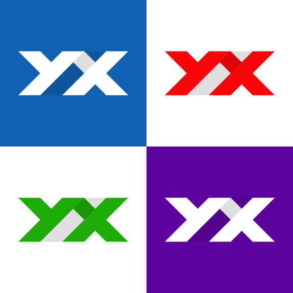
So here it was: a logo that incorporated all defined requirements in one way or another. Due to its dimensions, it could be used as (square or circular) favicon and avatar; the coloring worked both in a normal and flipped version. It, however, did not include the full written name Ypertex.
Conclusion 
In this article, I showed the approach I usually take on designing things—like in this case the Ypertex logo. However, especially the first in this two-step process applies to other areas of design as well, for example to IT Solution Design.
You also might have noticed that designing a logo is not only about pure artistic creativity; there is also quite some logic involved and cultural conventions play a big role, too.
Given that you now know the scope (object) and quality (objectives) of my logo design, you are welcome to judge it. In your opinion, does it fulfill the requirements I defined? I am curious to know what you think. Just keep in mind that logo design is not my primary profession… ;-)
By the Way 
By the way: I approached finding or rather designing the name of the blog the same way, setting most of the personality-related requirements already back then. Again, the Art of Omitting was useful—and helped create something vaguely familiar yet interestingly different by simply removing the first and last letters “H” and “t” from the word Hypertext.

Michael Schmidle
Founder of PrioMind. Start-up consultant, hobby music producer and blogger. Opinionated about technology, strategy, and leadership. In love with Mexico. This blog reflects my personal views.
Oct 4, 2021 · 4min read
Being Productively Creative—Artist vs. Designer
Have you ever experienced “writer’s block” or “masterpiece syndrome?” Here’s some advice on how to frame your mind, get into problem solving and be productively creative. Continue…
Jan 15, 2021 · 10min read
S2S: Stairs to Success
For most of us, success depends on the interaction with other human beings. S2S is a simple method that can help you be more successful. I’ll show you how. Continue…
Jan 7, 2021 · Feb 11, 2021 · 2min read
Deplatforming Trump
Short update: Today, I exercised my power as a user and left Twitter. Here’s why. Continue…


