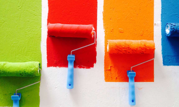
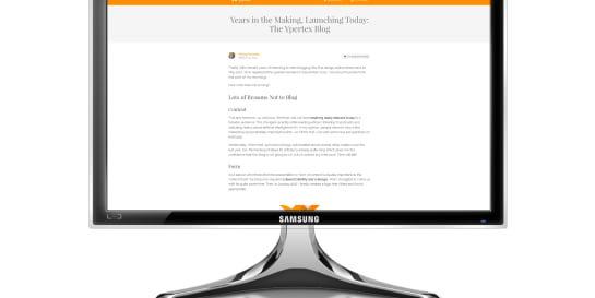
On this day three years ago, I launched my blog. Today, I publish its first redesign: bigger, bolder, bluer, and (hopefully) better than its predecessor. [Edited Jun 4, 2022]
To be honest with you, it’s a complete coincidence that the blog’s launch and this redesign are exactly three years apart. I didn’t plan it this way, I didn’t wait for this day. It’s magic!
Redesigning a blog after, what … 14 articles already? I know! I should be more focused on writing and less on tooling. But hey, I can’t deny that I’m a techie and hobbyist designer after all—so here we go:
What I Learned From Publishing 14 Articles so Far 
It’s Time Consuming 
First of all, writing an article takes more time than I initially thought. From the original idea to the final wording, from the proper quoting to the adequate visualization, it’s quite a work. Longer articles (with a reading time of over ten minutes) can easily take a total of eight hours or more to produce! Almost half of my articles so far fall into this category which explains a bit the low quantity of articles. However, I enjoy writing longer articles more as I learn more about a given subject myself.
Control Over Your Work-Flow Matters 
I’m glad to have found a publishing work-flow that doesn’t depend on a particular platform. Here’s how my process works:
I write my articles locally on my computer in a format called Markdown—which is nothing else than plain text. Any text editor does the trick, though I prefer using iA Writer.
Hugo transforms the Markdown files into HTML web pages. This happens as well locally, right on my computer. You can pick from a range of open source themes or define your own.
The Git repository that contains my Markdown source files and the rendered HTML web pages is then pushed to GitHub.
Netlify picks up the web pages and distributes them over the AWS CDN automatically every time I push the repo to GitHub.
Images are hosted on Cloudinary which takes out the pain of producing different resolutions and aspect ratios of responsive images (see below).
Matomo analytics run on a small virtual server that I operate.
In every step of the process, I’m in control. Here’s why it matters to me:
- At any time, I can swap out one or all tools. The source of my content goes into the cloud but remains local, too. If any of the non-local services would suddenly shut down, they wouldn’t take my content with them. I remain the owner of my content.
- I’m not restricted creatively by any platform. If I want to slightly tweak or completely overhaul my website theme, I can.
- I gain deeper insights by running my analytics. I don’t depend on the bits and pieces of user data that platform providers might offer. Yes, it’s not as efficient as consuming a managed service (at the very least, I have to put up a privacy policy now)—but using Matomo on Docker makes this almost a fire-and-forget operation.
Using Medium, LinkedIn, or other platforms for editing and publishing your articles? It might allow you to focus more on writing—but you better have an exit strategy in case the platform is going in a direction you don’t like.
And in case you wonder: Excluding domain registrar fees and the cost of renting the virtual server for Matomo, the monetary cost of running this blog is zero.
Title Capitalization in English Is Strange 
In German, headlines follow the same orthographic rules as any other text. In English however, there are several ways how professional publishers capitalize titles. The general rule is to capitalize the first, the last and the important words in the title.
There are four main styles: Chicago style, APA style, MLA style, and AP style. Fortunately, there are a few helpers like Capitalize My Title so I don’t have to remember the precise rules. (By the way: I’m defaulting to APA style.)
Images Can Be Responsive 
“Responsive” in the context of the web means that content responds to the particular device that’s used to browse it: A web page might look differently on a smartphone than on a tablet than on a TV monitor. I learned that images inside web pages can be responsive, too. See in the following examples how the size and aspect ratio of the images differ just by rotating your smartphone:
As it turns out, images are as static as always. You just provide several sizes and aspect ratios of the same image and the web page and browser determine which of the image versions to show under what circumstance. This can be very tedious, of course, but there are services available that automate this for you.
So while you provide the original image of a fixed size (width and height), services like Cloudinary can intelligently crop parts of the image. Using Artificial Intelligence, the interesting parts of an image (like faces) are identified and preserved in the cropped images. And they do this the lazy way, meaning: on the fly. Only once a user browses a web page with a certain type of device, the service renders the corresponding versions of the base image. Not a second earlier.
Such services are also able to automatically optimize image quality and compress file sizes.
Conclusion 
Celebrating the third anniversary of my blog with my 15th article—and a major redesign. I hope you like it! Follow me on social media to get notified of new content. On to the next three years until March 23, 2023!
Disclaimer 
I am in no way affiliated with the services mentioned in this article. I recommend them as a blogger who employs their free services for personal use.

Michael Schmidle
Founder of PrioMind. Start-up consultant, hobby music producer and blogger. Opinionated about technology, strategy, and leadership. In love with Mexico. This blog reflects my personal views.


Oct 4, 2021 · 4min read
Being Productively Creative—Artist vs. Designer
Have you ever experienced “writer’s block” or “masterpiece syndrome?” Here’s some advice on how to frame your mind, get into problem solving and be productively creative. Continue…